
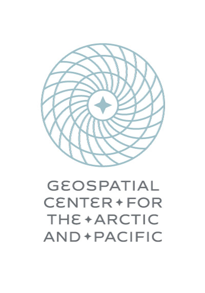
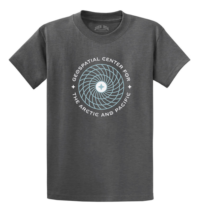
Hello GCAP Members, If you have feedback on the GCAP logo (attached), please send it my way by the end of next week, April 5. Chirs and I will compile and share with the logo and website designers. Thanks, Jenna From: Gcap_members <gcap_members-bounces@engr.oregonstate.edu> On Behalf Of Parrish, Christopher Sent: Wednesday, February 28, 2024 7:57 PM To: gcap_members@ENGR.ORST.EDU <gcap_members@engr.oregonstate.edu> Subject: [Gcap_members] FW: GCAP website development & maintenance Hi GCAP Members, Here are some GCAP logos designed by Nicole Aue at 45th Parallel Design, and the email below contains descriptions of the designs. -Chris From: Nicole Aue, 45th Parallel Design <info@45th.design<mailto:info@45th.design>> Sent: Wednesday, February 28, 2024 2:40 PM To: Parrish, Christopher <Christopher.Parrish@oregonstate.edu<mailto:Christopher.Parrish@oregonstate.edu>>; Borberg, Jenna <jenna.borberg@oregonstate.edu<mailto:jenna.borberg@oregonstate.edu>> Cc: Megan | Websites 503 <megan@websites503.com<mailto:megan@websites503.com>> Subject: Re: GCAP website development & maintenance You don't often get email from info@45th.design<mailto:info@45th.design>. Learn why this is important<https://aka.ms/LearnAboutSenderIdentification> [This email originated from outside of OSU. Use caution with links and attachments.] Hi Chris and Jenna, Here is the GCAP logo that I described last week for your review. Files include renderings in badge, landscape, and portrait view. I've also included a rendering of the logo on a t-shirt to assist with envisioning real-world applications for the logo's use. I imagine that the "badge" version of the logo is what would be used in the majority of applications, both because the square shape is versatile for many use cases, and because it has a bit more "flair." The three 4-pointed stars align precisely in the horizontal center of the logo, and the diamonds appearing inside the letters A, C, and O accentuate the 4-pointed stars. I left the diamonds out of the letters in the landscape and portrait versions of the logo because at the larger text size, they were "too much." Instead, I added 4-pointed stars between words in the name to tie the wordmark to the logomark visually. Incorporating this consistency between the icon and the accompanying text adds cohesion to the visual brand. At a broad level, the overall design conveys math, science, geography, earth, and space, with some humanistic/organic elements thrown in to communicate the underlying reasons that scientists actually conduct scientific research. The humanistic/organic elements include the curves on the meridian lines and the idiosyncratic curve of the letter E in the text. The curve of the meridians serves several other purposes, including communicating dynamism, change, innovation, and action. I mentioned other purposes of the logo's various design elements in last week's email (below). I am happy to answer any questions you might have. Let me know what you think! Thanks, Nicole -- Nicole Aue 45th Parallel Design, LLC 503.329.8453<tel:503-329-8453> | info@45th.design<mailto:info@45th.design> Visual/Brand Identity and Graphic Design UI/UX and Web/App Design and Development [45th Parallel Design icon]<https://nam04.safelinks.protection.outlook.com/?url=https%3A%2F%2F45th.design%2F&data=05%7C02%7Cgcap_members%40ENGR.ORST.EDU%7C9b294dc8ebea40c6632c08dc4eb909e2%7Cce6d05e13c5e4d6287a84c4a2713c113%7C0%7C0%7C638471803831811036%7CUnknown%7CTWFpbGZsb3d8eyJWIjoiMC4wLjAwMDAiLCJQIjoiV2luMzIiLCJBTiI6Ik1haWwiLCJXVCI6Mn0%3D%7C0%7C%7C%7C&sdata=sI1PL2ScKKIW%2BuzyX8oapD%2F%2FjkpjslgEtdKhVzGRdTA%3D&reserved=0> https://45th.design<https://nam04.safelinks.protection.outlook.com/?url=https%3A%2F%2F45th.design%2F&data=05%7C02%7Cgcap_members%40ENGR.ORST.EDU%7C9b294dc8ebea40c6632c08dc4eb909e2%7Cce6d05e13c5e4d6287a84c4a2713c113%7C0%7C0%7C638471803831811036%7CUnknown%7CTWFpbGZsb3d8eyJWIjoiMC4wLjAwMDAiLCJQIjoiV2luMzIiLCJBTiI6Ik1haWwiLCJXVCI6Mn0%3D%7C0%7C%7C%7C&sdata=sI1PL2ScKKIW%2BuzyX8oapD%2F%2FjkpjslgEtdKhVzGRdTA%3D&reserved=0>